Loading article…Mobile-First Design & SEO: Why Your Business Needs It
Web Design
admin5 min read
Why Mobile-First Design Is No Longer Optional
People usually don’t wait until they get home to specifically open their laptops or PCs to buy products or services, or to browse for the best restaurants or businesses. They search from a mobile phone while traveling, sitting at work, or lying in bed.
That’s why it is important to have a website with a mobile-first design approach. It will help users to navigate easily, read content, or find what they need on a mobile phone. For this reason, businesses must consider mobile users from the beginning.
That is where mobile-first design comes in.
In this blog, we will run you through the importance of mobile-first design and why it is no longer optional for businesses.
But first, know what mobile-first design is.
What Is Mobile-First Design?
Mobile-first design is the strategy to develop and optimize website design for mobile phone users. Commonly, businesses design websites for desktops first. After that, the designers make it responsive for mobile phones. The problem with this approach is that shrinking a desktop website design does not fit perfectly on mobile phones.
People usually tap and scroll more on mobile phones and want to browse quickly. That is why mobile-first design requires strategic planning so people can interact with the business easily.
No Longer An Option
Let’s discuss why mobile-first design is no longer optional.
1. Mobile Traffic Has Grown
Statista estimates that 51.48% of traffic comes from mobile devices across the globe. If your website doesn't work well on mobile, then you are missing out on some people.
A mobile-first website design can improve your business conversions. It also gives you multiple benefits and an edge to stand out in the market. Moreover, it ensures your potential customers can navigate through your website easily.
Any website that is user-friendly, fast-loading, and easy to use can assist businesses in keeping their users’ attention longer. This will not only assist them in creating a better user-friendly environment but will also help in establishing a sense of trust in visitors.
Mobile-first design is an approach that embraces the constraints of smaller screens and focuses on what’s indispensable for users, improving the overall mobile User Experience (UX).
Google focuses on mobile-first design because most people use phones to browse the internet. This is why Google’s algorithm first considers a website's mobile version when ranking and indexing pages, matching how modern users search.
Mobile-first design boosts conversion rates by prioritizing small screens. This forces clean layouts, fast load speeds, and easy touch controls. Users face less clutter and find checkout or sign-up buttons more quickly.
Google uses the mobile version of a website as the primary source for indexing and ranking search results. This is known as Google mobile-first indexing. Google's crawler evaluates how the site appears and functions on mobile devices to determine its position in search engine results pages.
Get in Touch
Define your goals and identify areas where we can add value to your business.
LET'S TALK ABOUT YOUR PROJECT
Connect with us directly and get personalized guidance every step of the way.
California, USA
2. Mobile UX Drives Higher Conversion Rates
Have you ever left a website just because its navigation buttons were too complex on your mobile phone?
You got frustrated!
Your users feel the same and leave negative feedback about your website. If you have a mobile-first optimized design with easy-to-use buttons and readable content, people are likely to engage and become returning customers. These mobile UX and mobile usability improvements will eventually reduce your bounce rate.
One important thing about mobile conversions is that users are impatient. This is psychology. Mobile-First websites make navigation easier for your users and keep them engaged. This leads to higher sales and ROI.
3. Google Prioritizes Mobile-First Indexing
The more your website is mobile-friendly, the more chance it has of getting higher rankings. This is because the majority of your potential customers use smartphones. Another reason may be that a mobile-first design website ranks higher than other sites.
Additionally, Google's mobile-first indexing uses your mobile website as the primary version for ranking your website. If you have an excellent mobile-first design website that matches Google’s mobile-first indexing guidelines, it ranks you higher.
4. Mobile-First Design Improves Site Speed
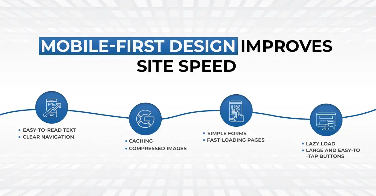
An optimized mobile-first website design gives users a professional, fast, and engaging experience. When they browse your website through mobile phone, they can easily interact. A mobile-first design can improve site speed by using compressed images, caching, and lazy loading to help pages load faster and keep the browsing experience smooth.
Mobile page speed optimization may focus on:
Clear navigation
Easy-to-read text
Compressed images
Caching
Lazy load
Fast-loading pages
Simple forms
Large and easy-to-tap buttons
Important information placed where users can find it quickly
When a potential customer has an engaging interaction with your website, they are more likely to proceed to the next step of buying your product. Google states that the bounce rate increases by 32% when your website’s loading time increases to 3 seconds.
5. Supports Data–Driven Decision-Making
Mobile-First design helps businesses make good decisions by monitoring real-time user behavior. It also assists businesses in checking where users scroll, stay, navigate, and interact with the various features.
This means that you have a higher rate of bounce due to the presence of small CTA buttons on your site, or the buttons are too small for users to see. To make your CTA buttons more prominent, one way would be to place them at the top of your site.
Mobile analytics can also help businesses understand:
Which pages mobile users visit the most
Where users drop off
Which buttons receive the most clicks
How long visitors stay on a page
Which devices users prefer
What content leads to more conversions
What Is the Difference Between a Traditional Approach and a Mobile-First Approach?
The website with a common approach starts with bigger screens and then optimizes for mobile devices. However, a mobile-first approach to design is quite the opposite. It is developed initially for mobile phones and after that for desktop devices. This typically focuses on the content, pictures, and CTA buttons.
Have a look at the table below and learn the differences between traditional and mobile-first approaches.
Traditional Design Approach
Mobile-First Design Approach
Starts with desktop screens
Starts with mobile screens
Adjusts the design for smaller devices later
Builds the experience for larger screens later
Can include unnecessary elements
Focuses on essential elements
May create mobile usability issues
Prioritizes mobile user experience
Often treats mobile as secondary
Treats mobile as a priority
How to Optimize Website Performance for Mobile-First Design?
Performance optimization is one of the major practices when it comes to mobile-first design. There are many approaches to this, but using responsive layout design, easy navigation, clear content, and readable fonts is among the best things you can do.
Moreover, consider different mobile devices to test your website and ensure it is easily accessible to everyone.
To improve your site's performance, use concise content and optimized images so your customers can read them easily on a small screen. Lastly, you can design it so users can access all options with a single button or thumb.
Final Thoughts!
A mobile-first design strategy is very important for the success of any business. The reason behind this is that many users visit websites through mobiles. If you provide them with good mobile-first design, you will grab their attention, and they will be your returning customers.
Once your potential customers come across your website, your mobile-first design approach makes sure that they use the controls and navigate through your website easily to find out about your products and services.
If your website isn’t delivering a great mobile experience, now is the right time to improve it. Get in touch with AdamIS Tech to create a fast, user-friendly, and conversion-focused website built for today’s mobile users.
21900 Burbank Blvd Ste 300-A,
Woodland Hills, CA, 91367-7418, USA

 Web Design